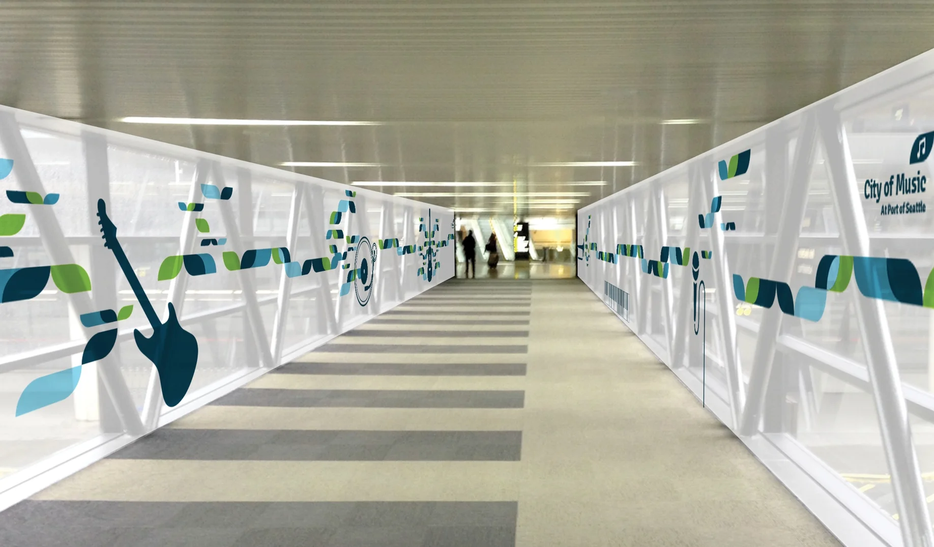
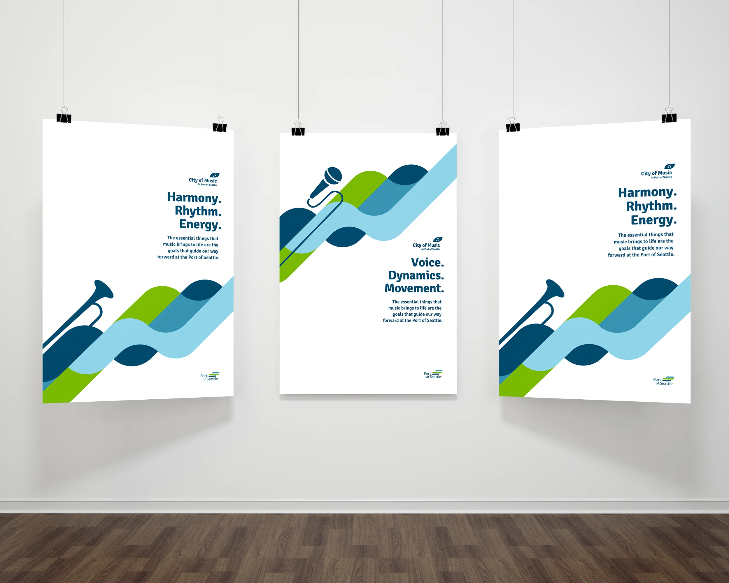
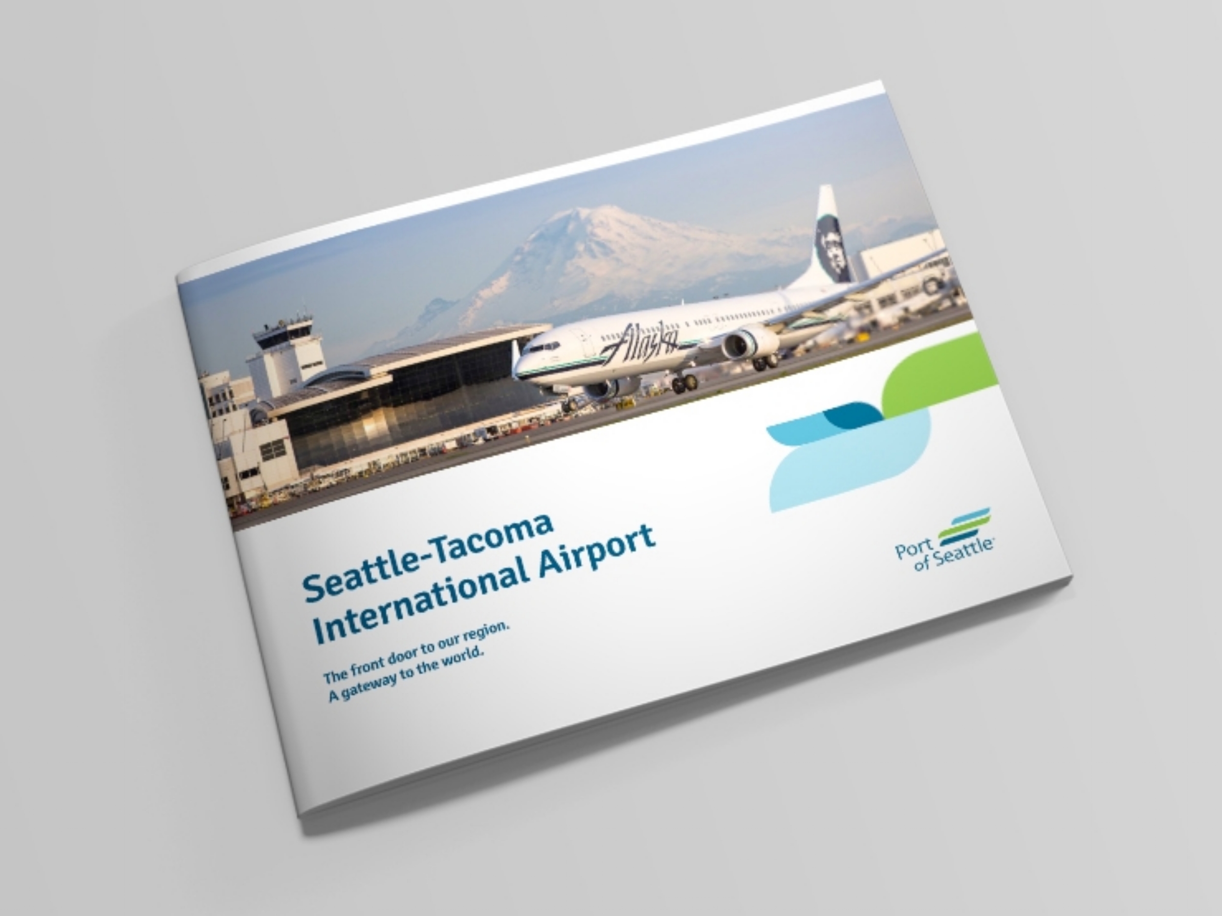
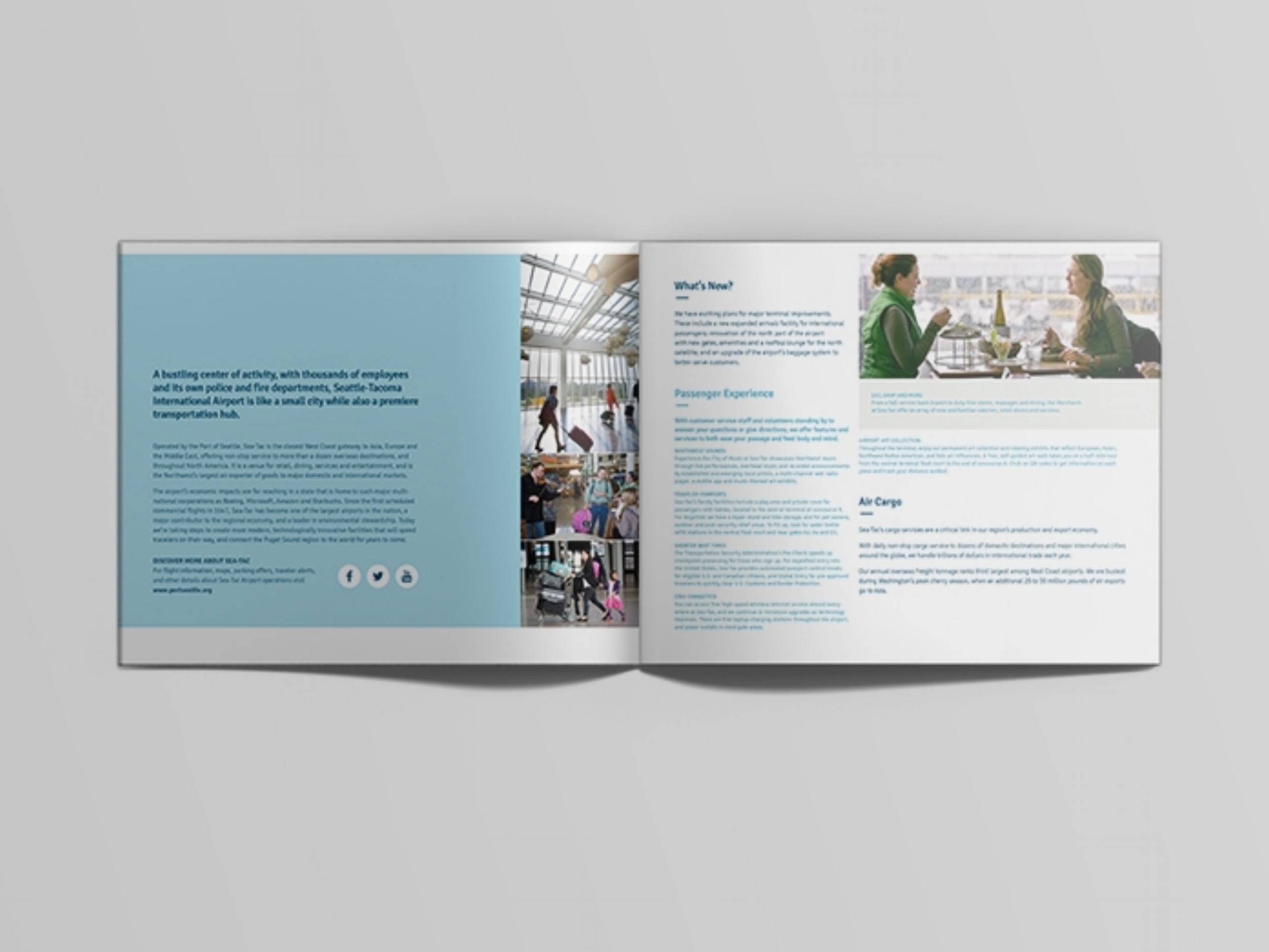
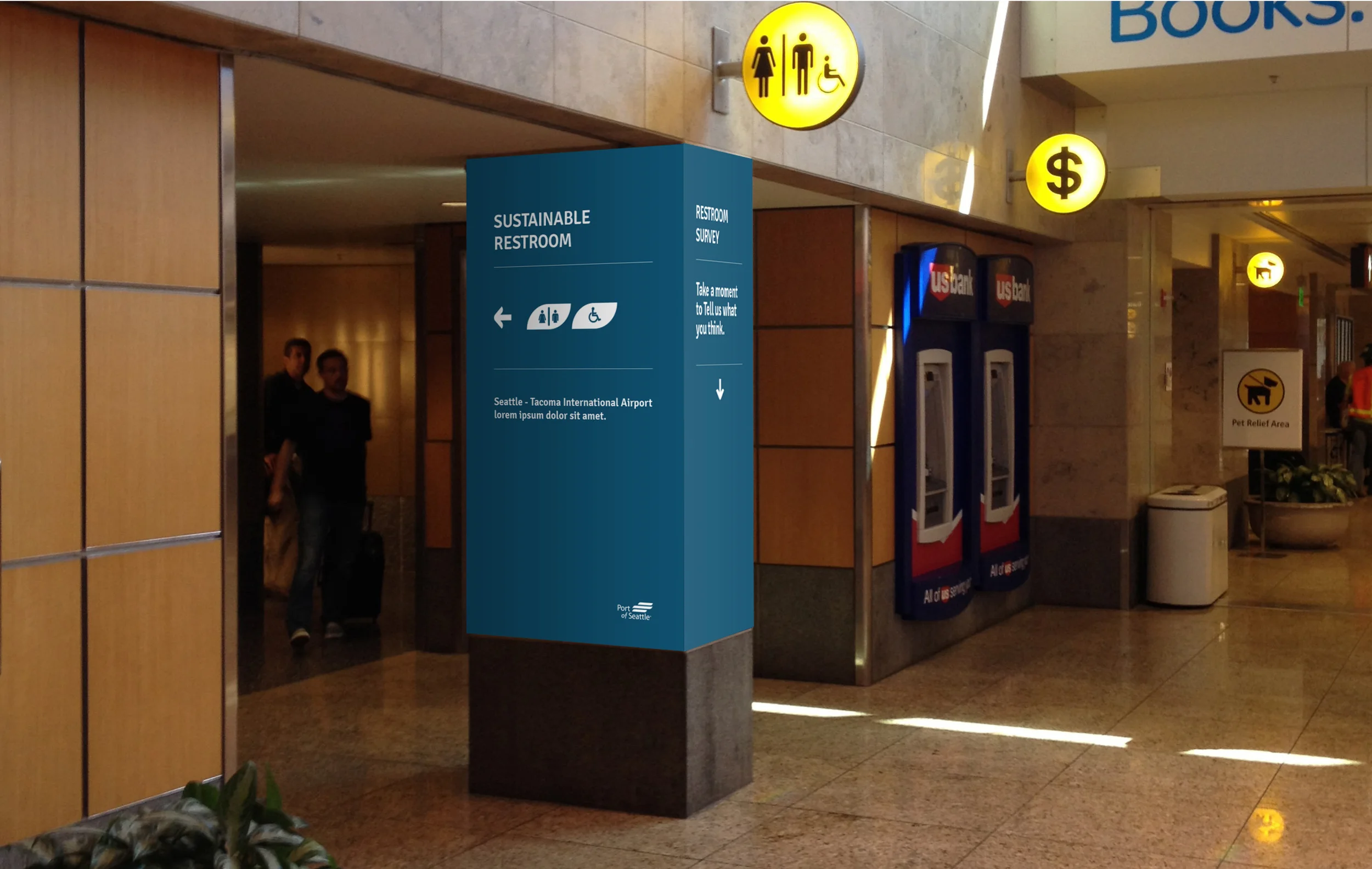
I was initially tasked with the redesign for the logo for Port of Seattle. The approach spoke to the Port's momentum for positive change, along with environmental awareness and sustainability. The logo mark represents the three physical aspects of the Port: land, sea and sky. From the rollout of the new logo, I created a robust brand ecosystem that would inform visual communications for the Seattle port as well as SEATAC airport.
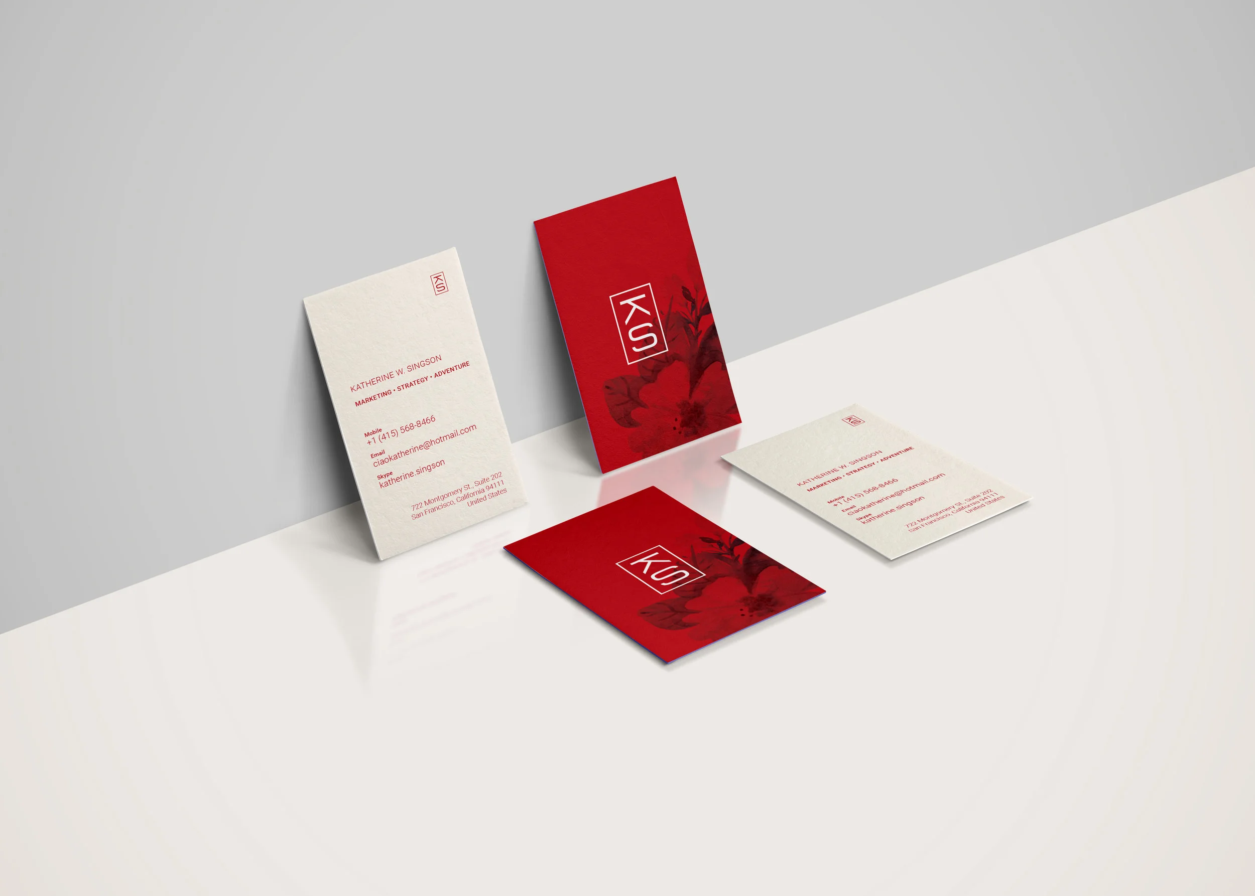
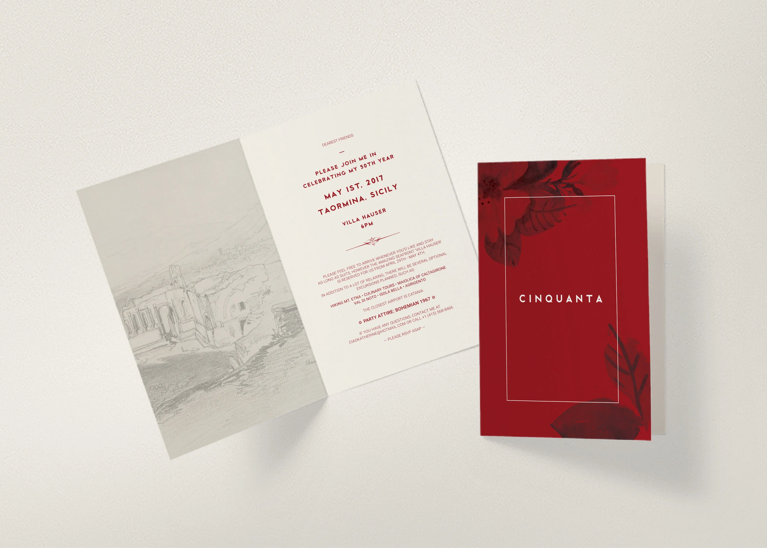
Brand and stationary for marketing executive that evokes a sense of the exotic, while also being professional and sophisticated.
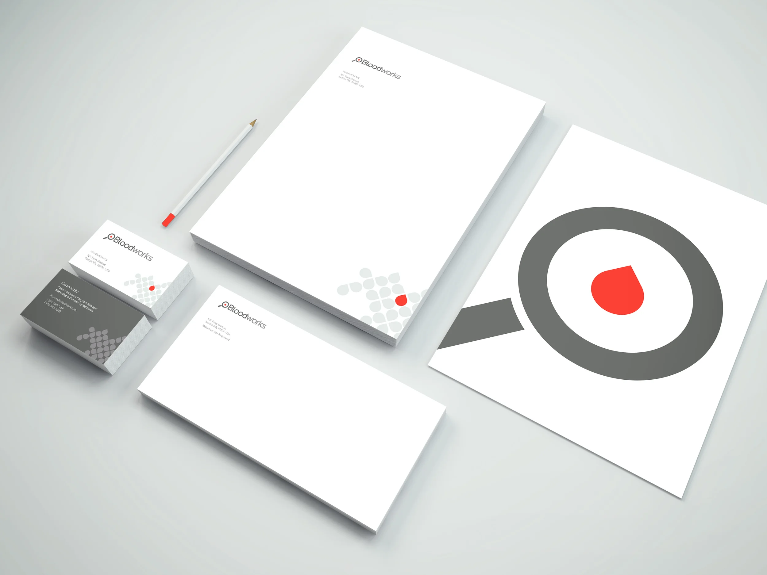
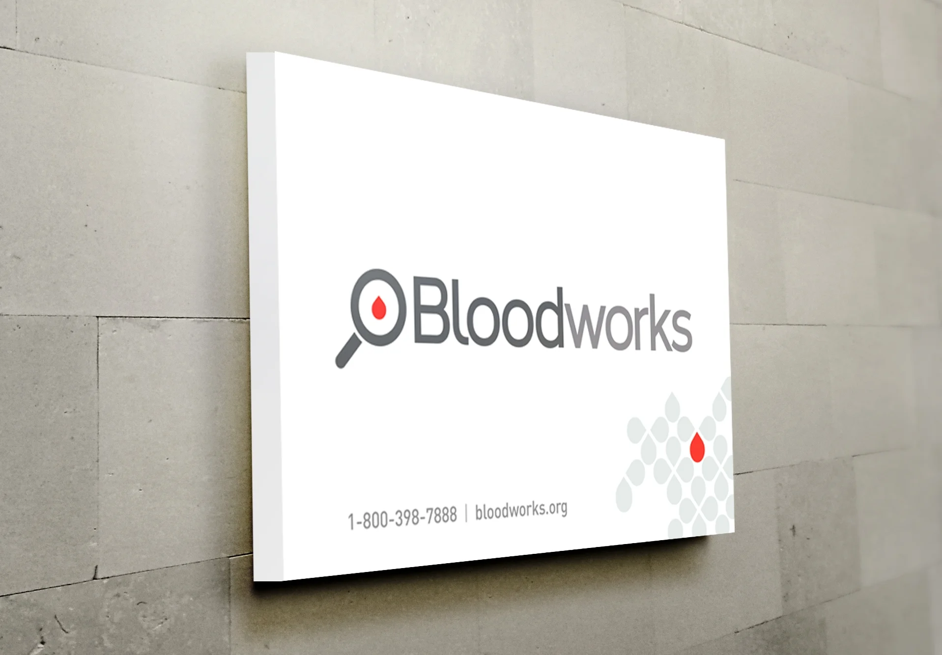
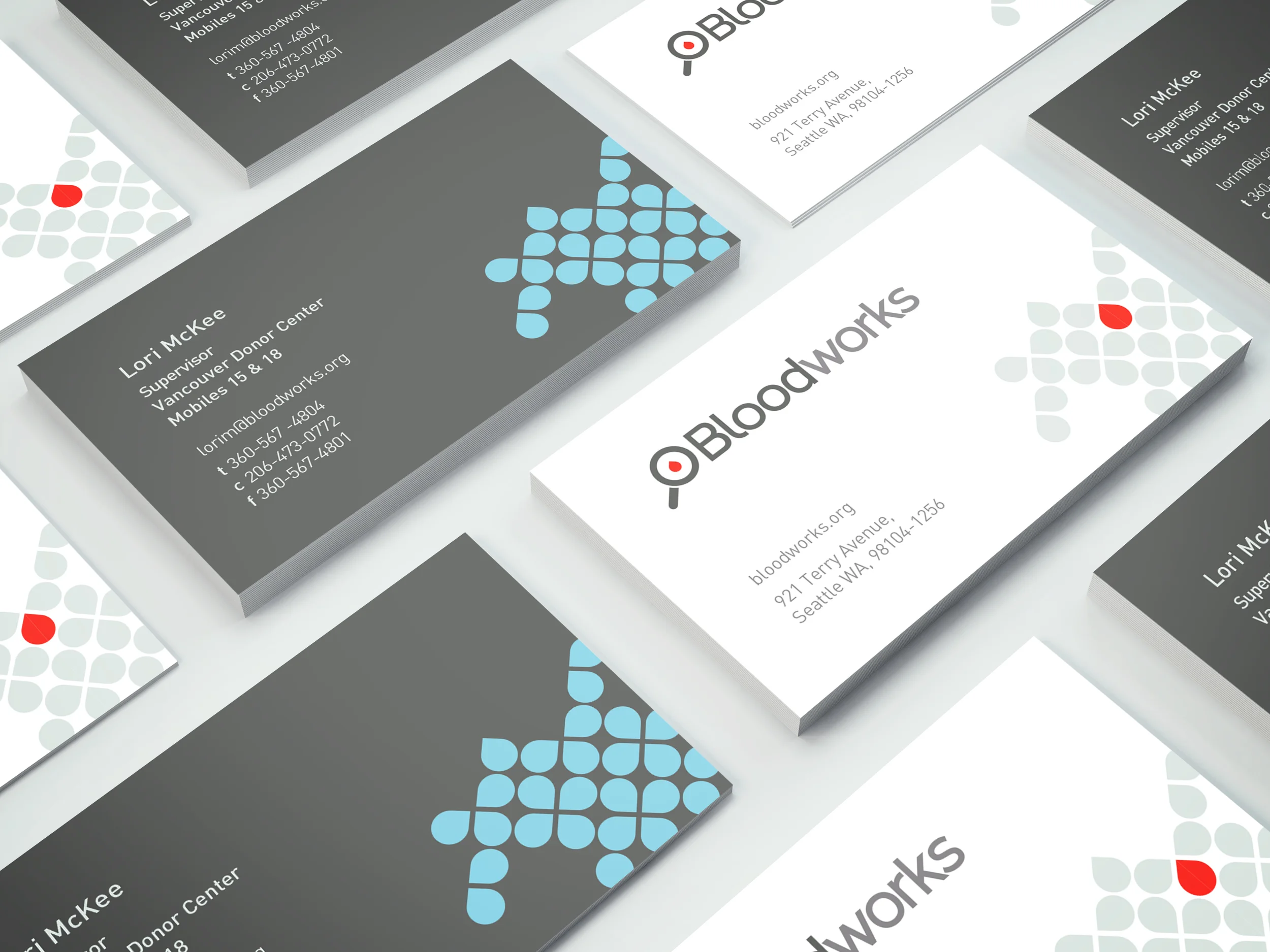
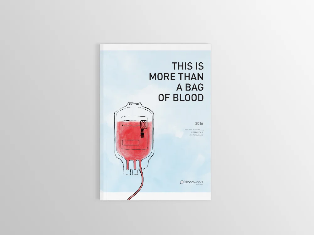
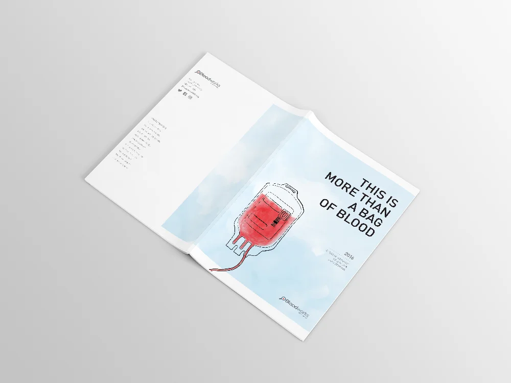
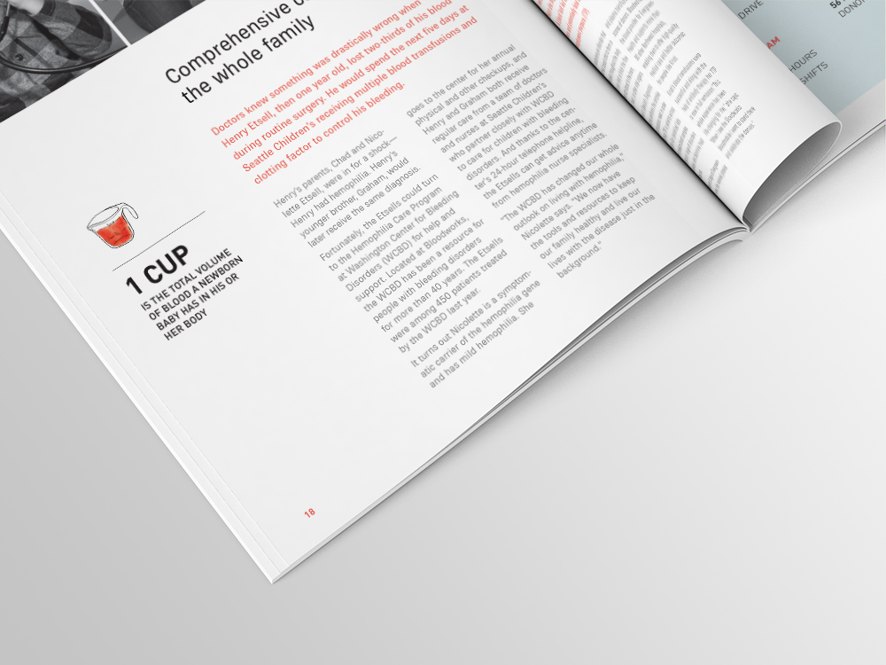
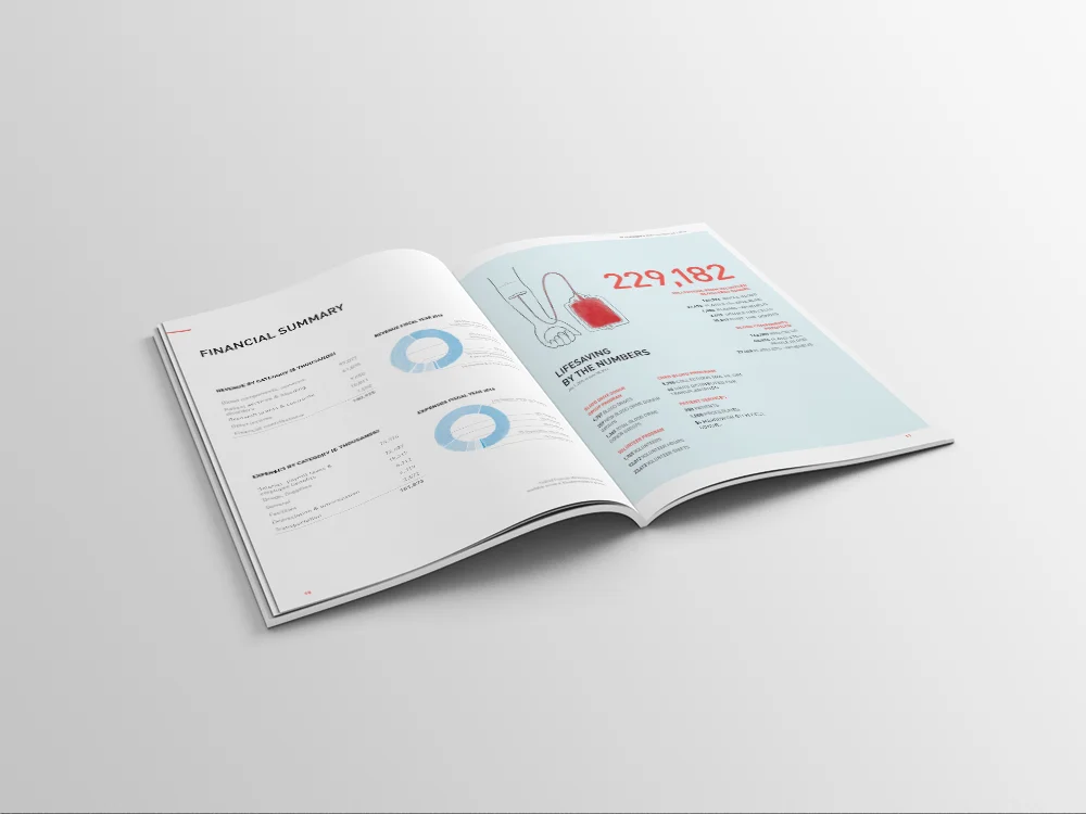
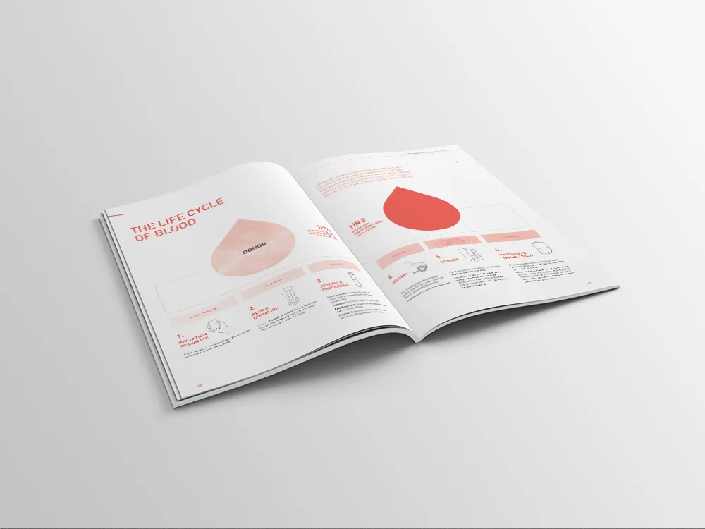
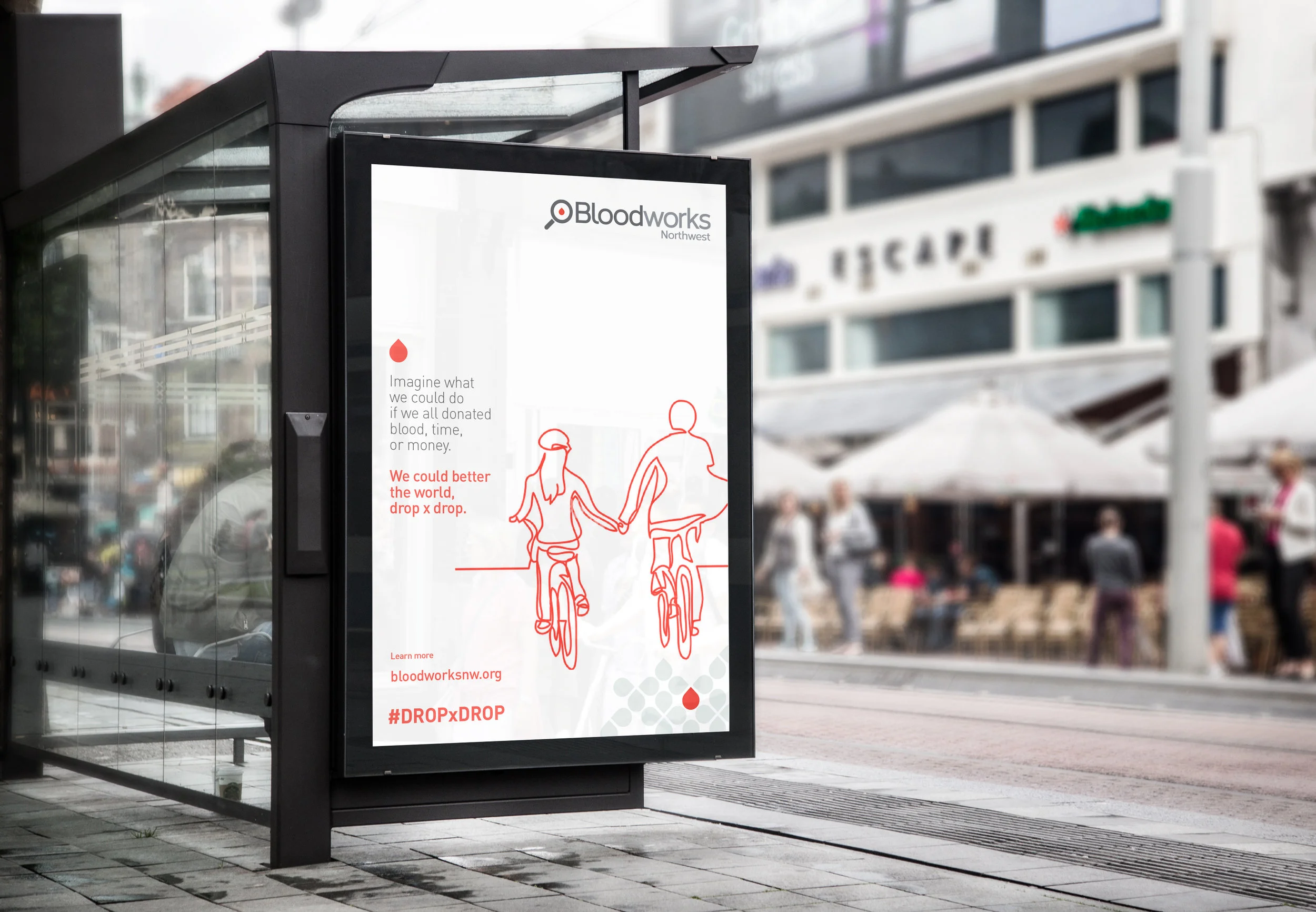
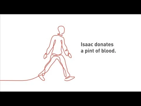
One of my passions is to work with clients who provide positive change in their community. Bloodworks is one such organization. I wanted to provide a logo and brand that was befitting of their transformation into a more modern and humanistic approach. Blood donation is a powerful and positive thing, yet also comes with negative, fear-based connotations. It was rewarding to create a brand language that would tackle this dynamic.
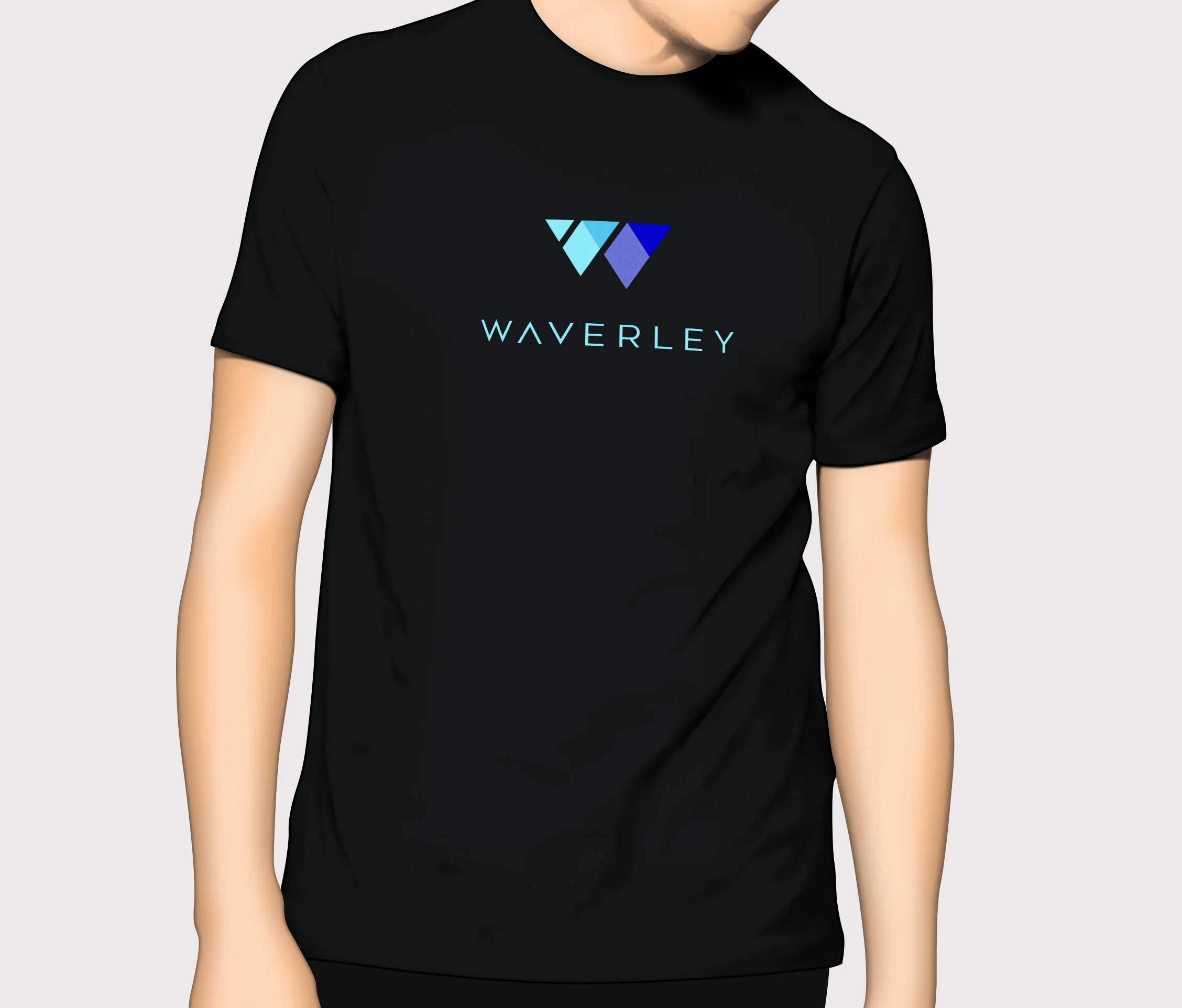
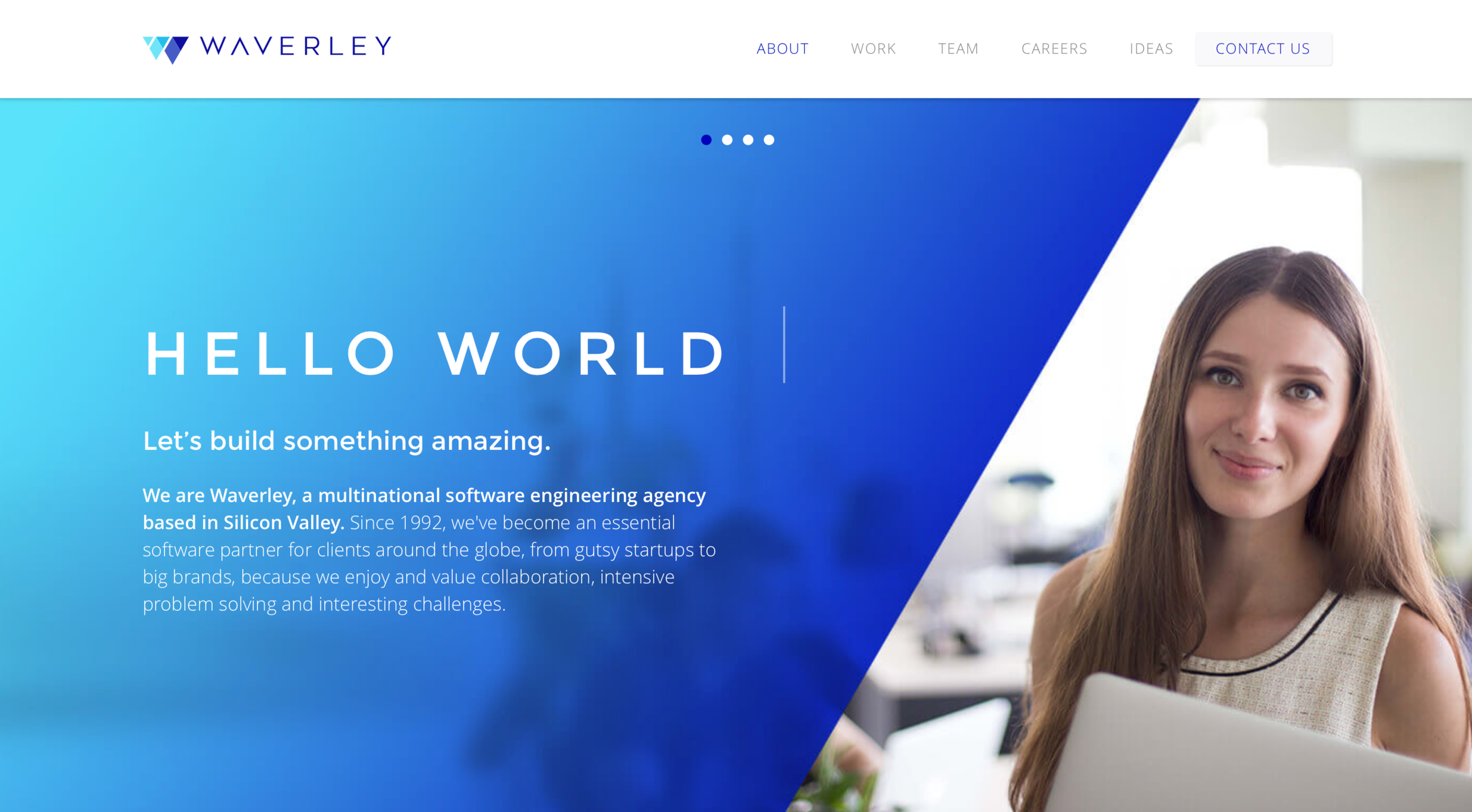
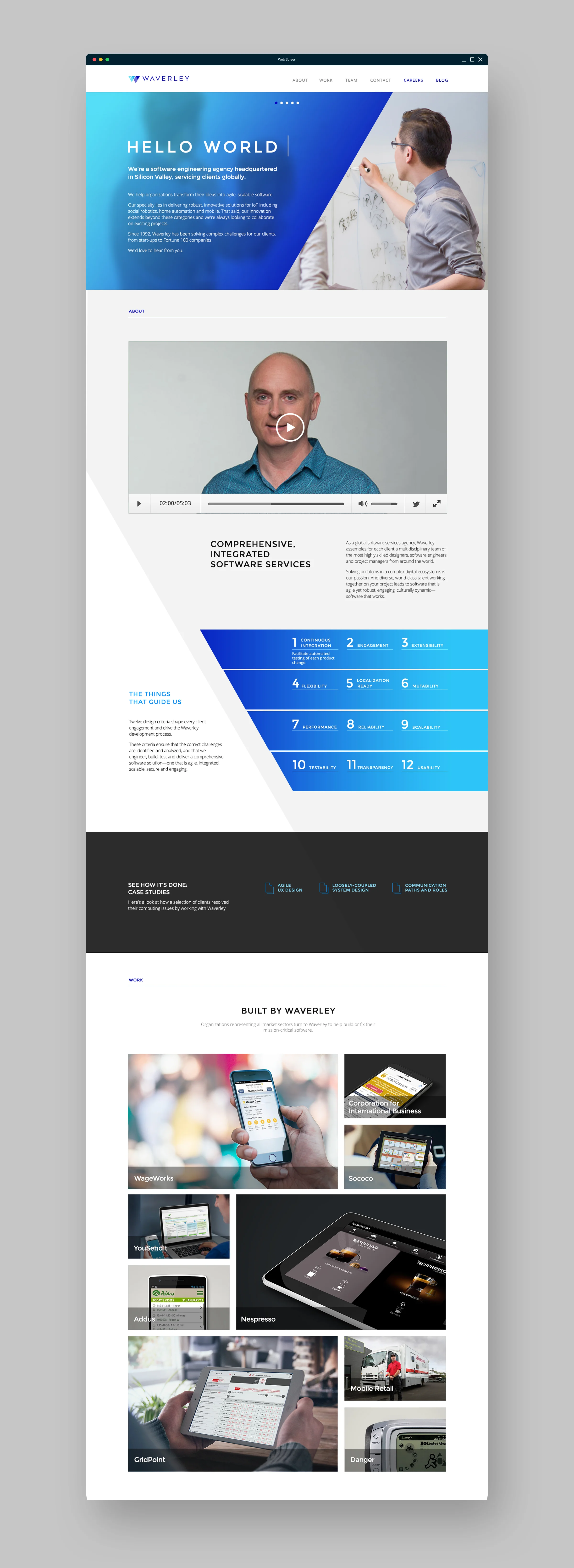
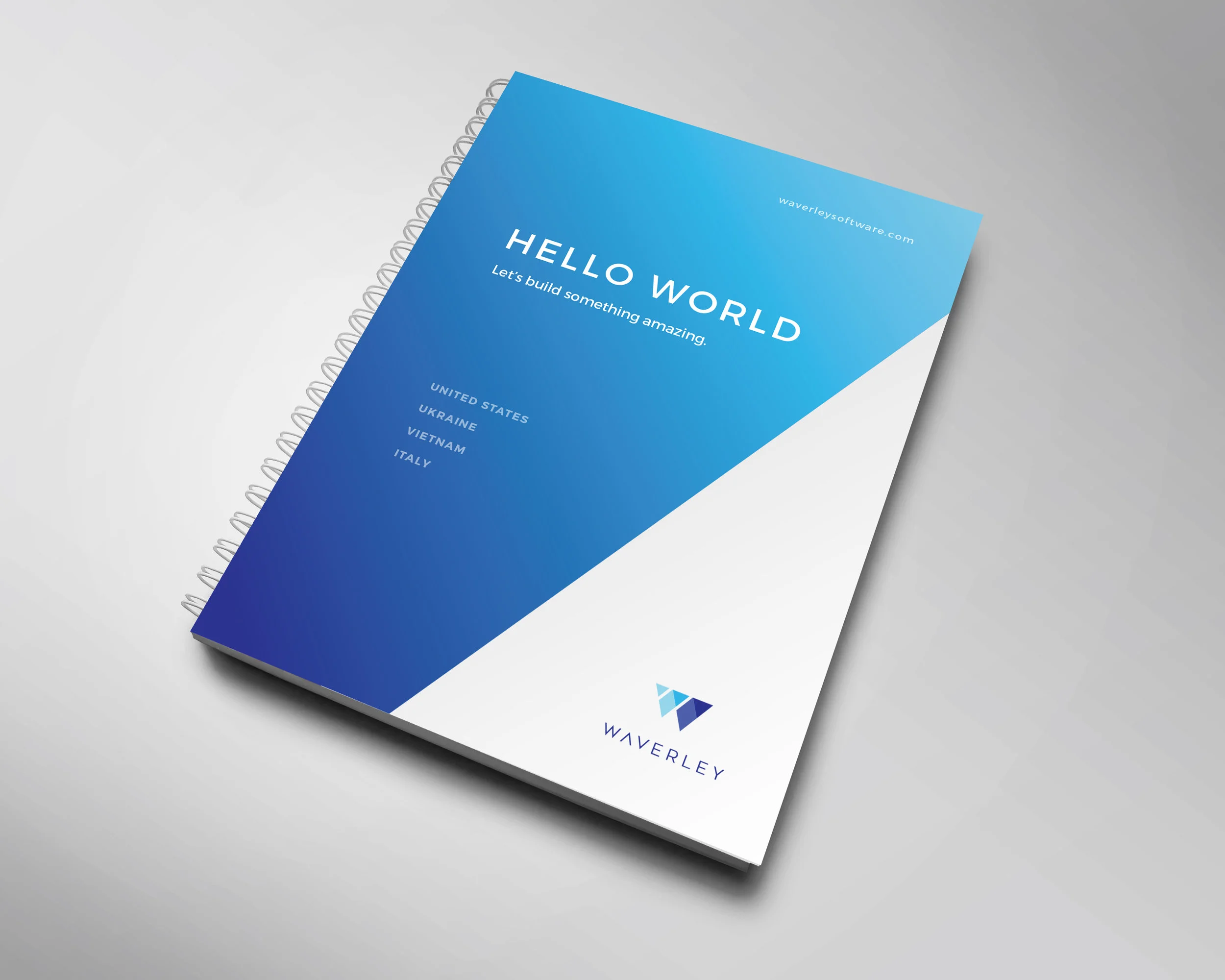
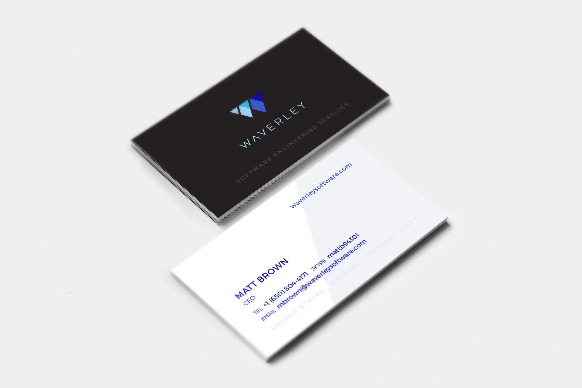
Comprehensive brand redesign for Silicon Valley based software engineering company, Waverley Software.
waverleysoftware.com
I’ve had the opportunity to work on the Apple Retail and Channel Marketing design teams as an art director at Apple. Unfortunately, I can’t disclose any imagery of my work from that time.
My key roles:
iPad: Co-designed and directed the look and feel for the product launch across web, print and point of sale marketing
Mac: Worked on holiday campaigns and the Back to School campaigns
iPod: Created and directed design for product launch of the iPod touch
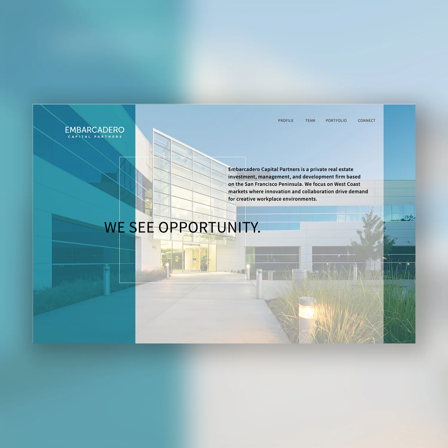
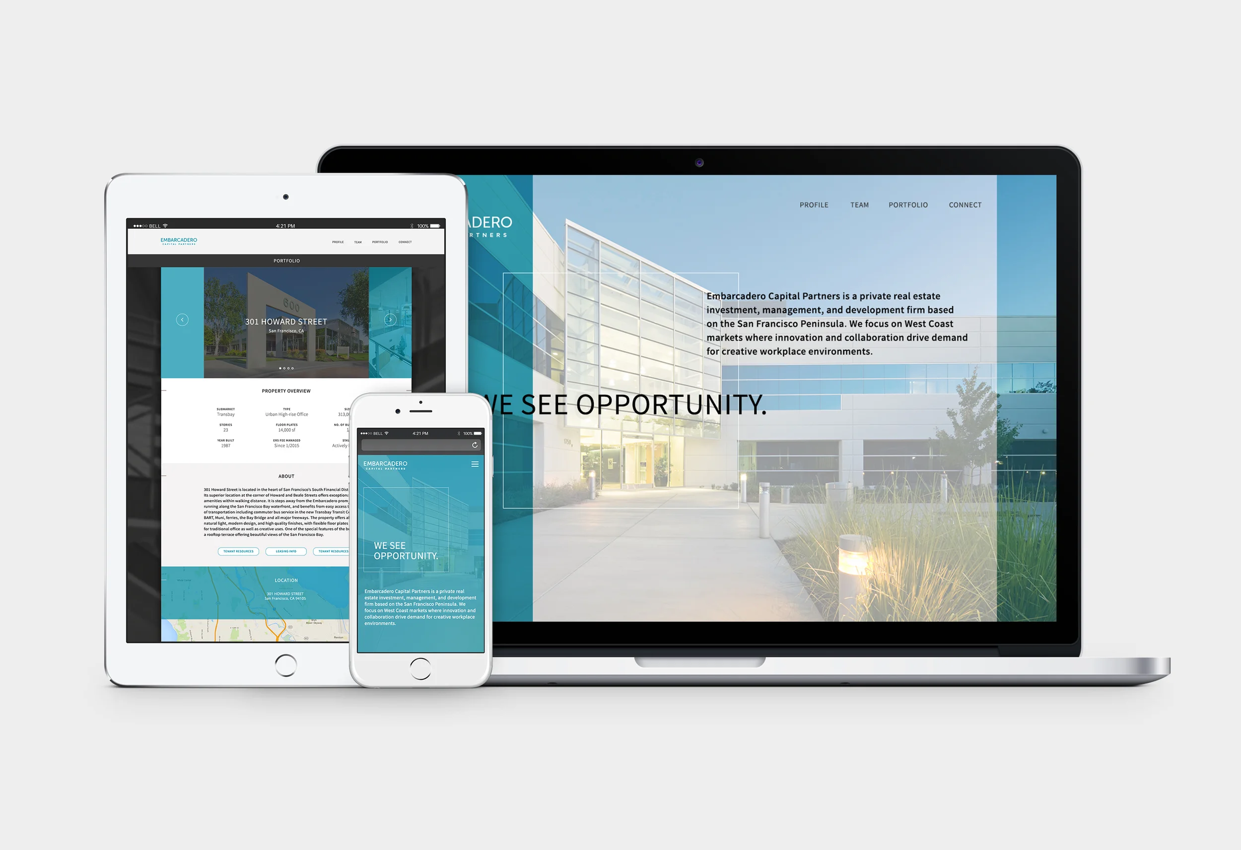
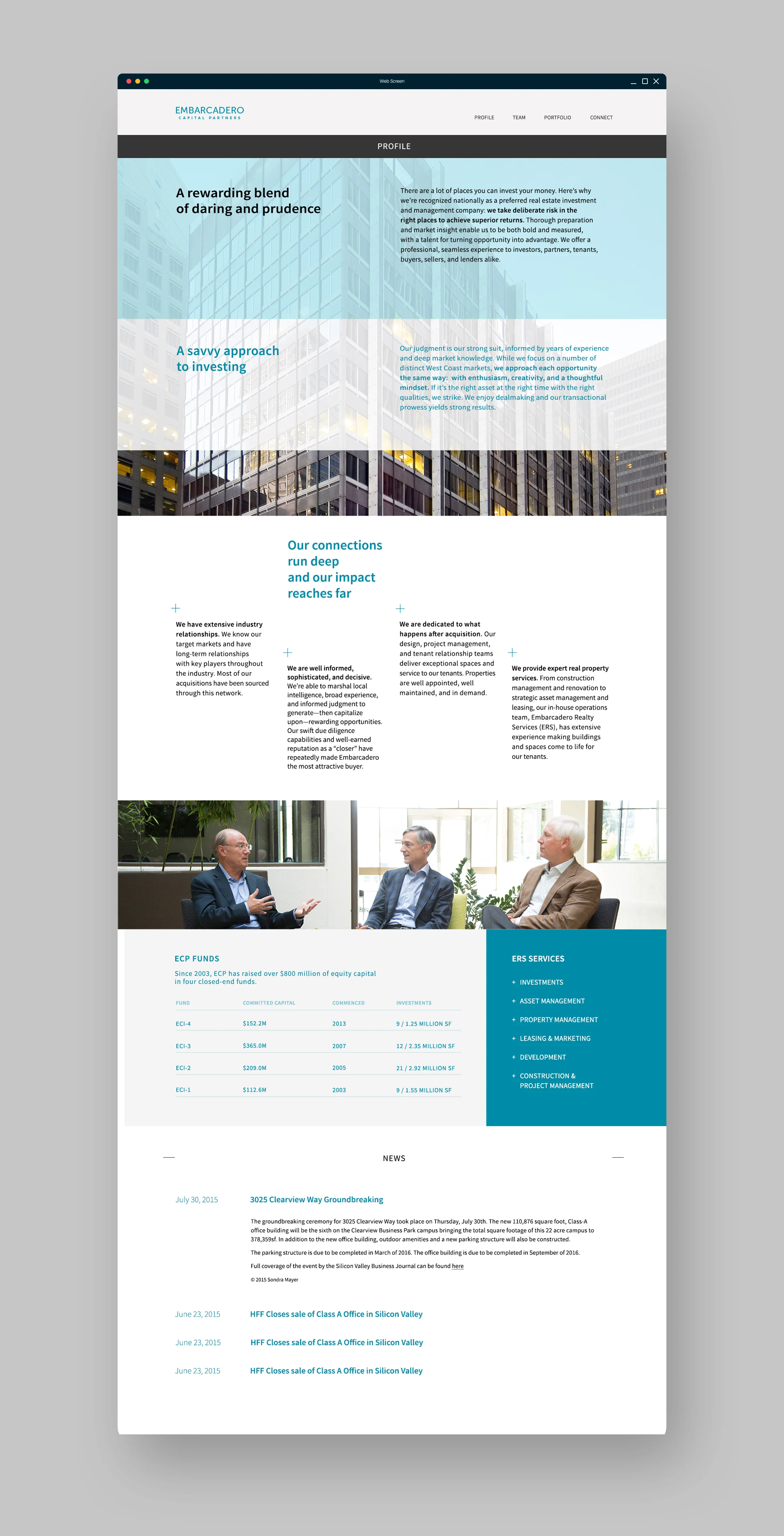
Embarcadero Capital Partners is a real estate investment and management firm based in San Francisco. They required a complete brand redesign along with a new, responsive website.
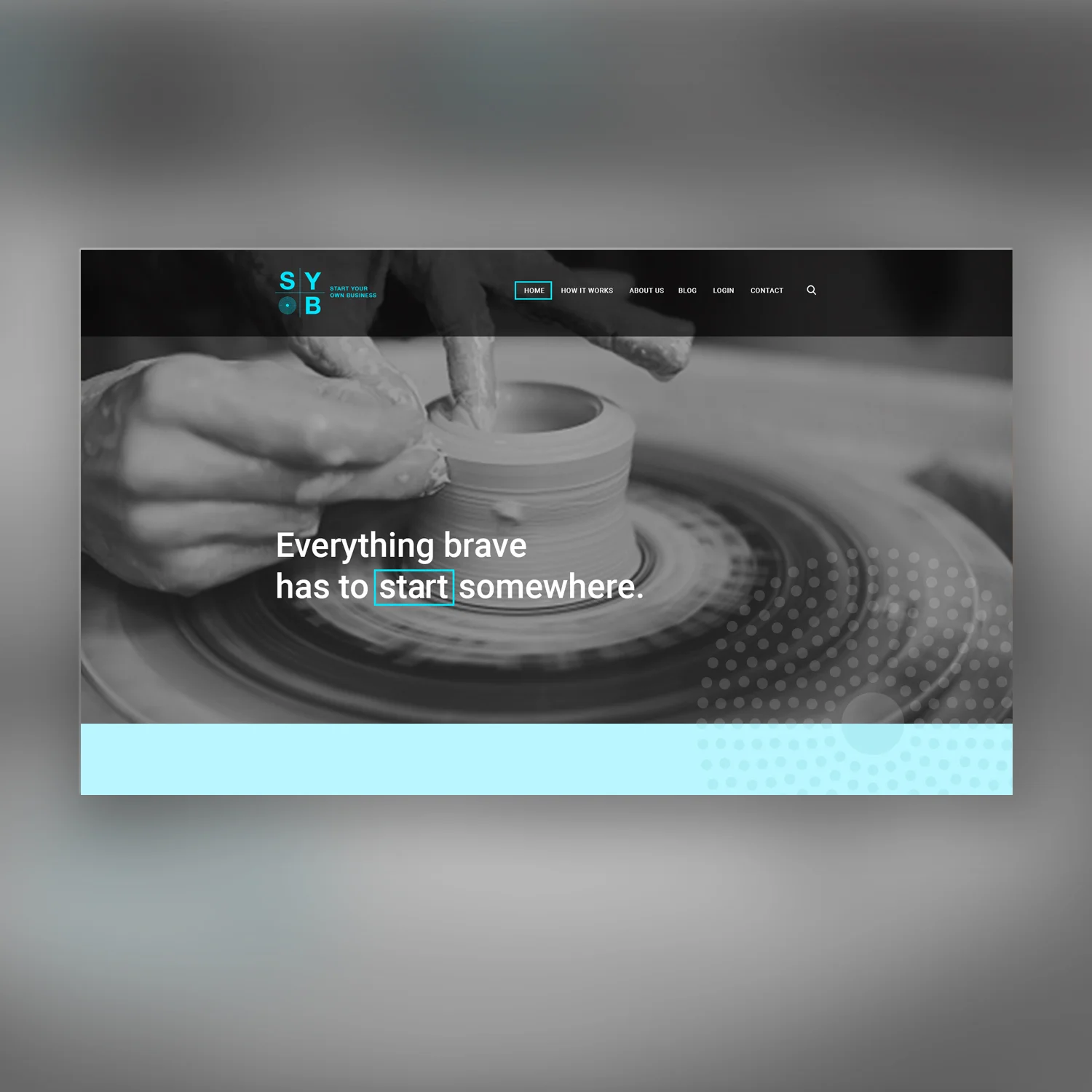
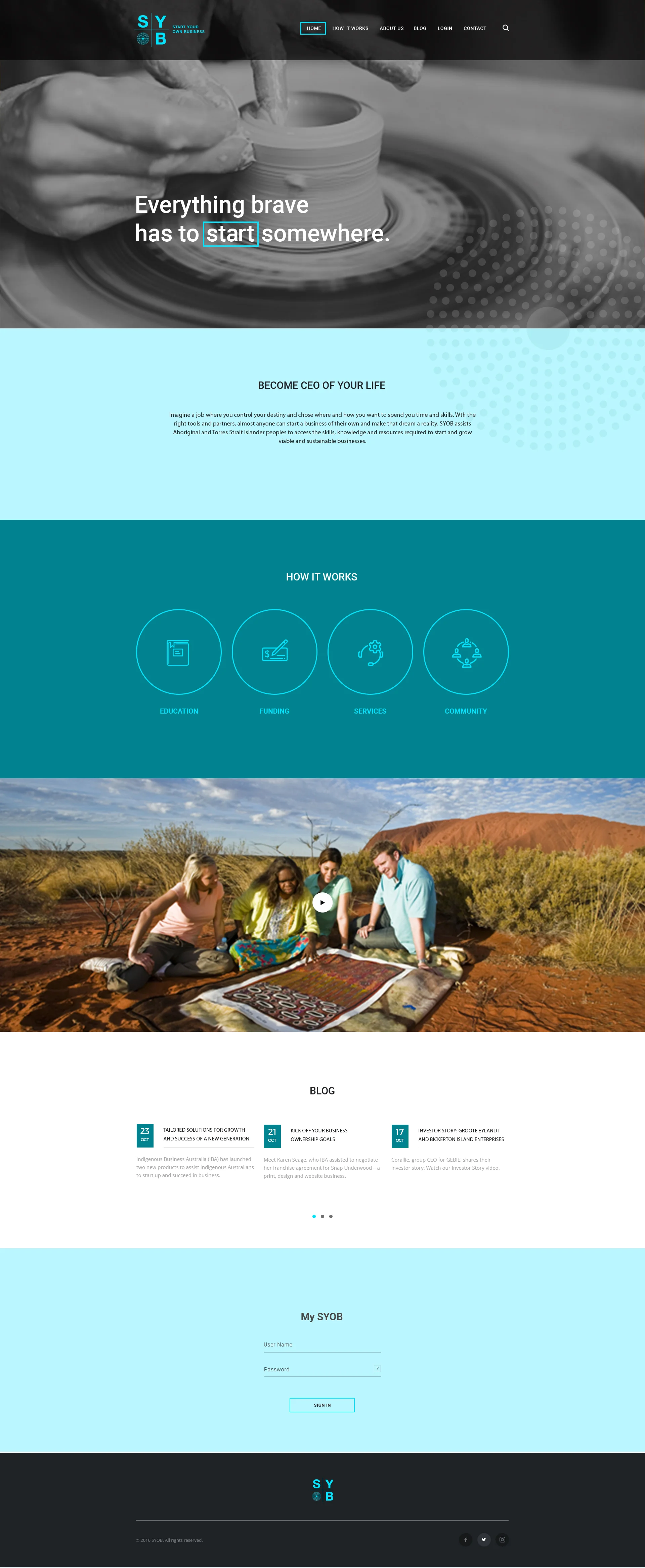
SYOB stands for Start Your Own Business and is an Australian startup poised to help indigenous people start a business from scratch. I wanted the logo design and brand look and feel to communicate modern simplicity, as well as incorporating the indigenous Australian culture and history. Action oriented, editorial style photography is paired with motivational copy to evoke action and change.
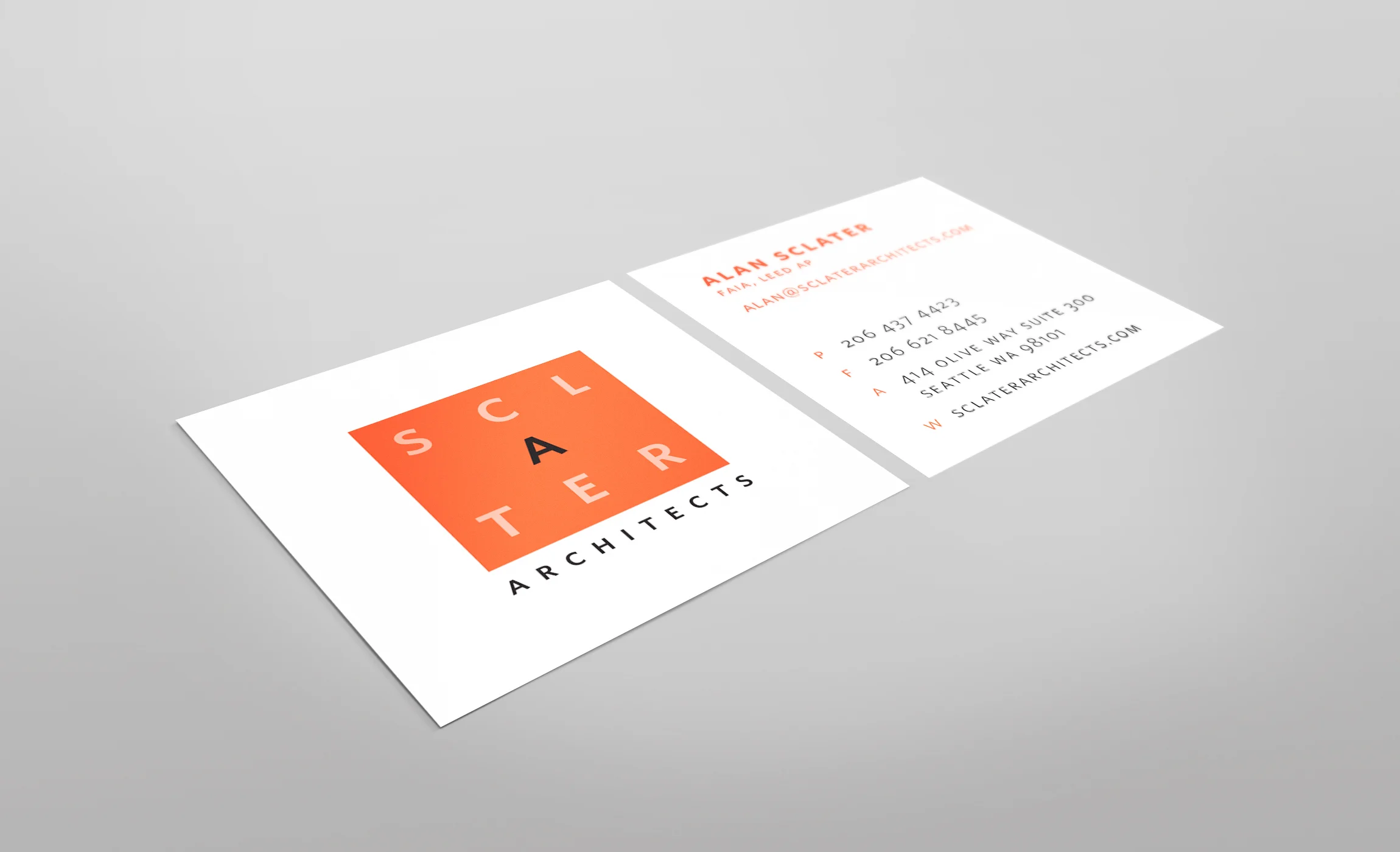
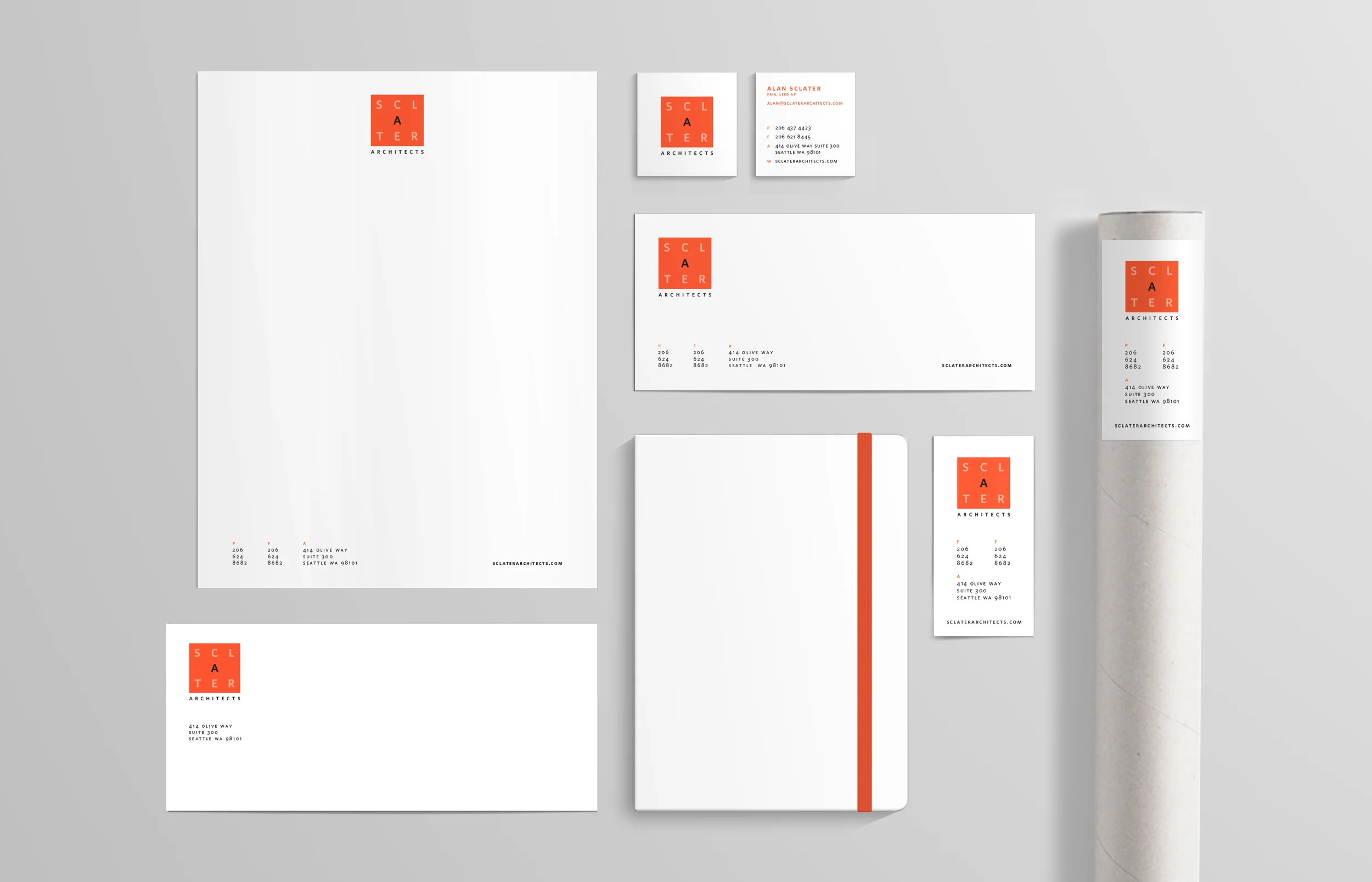
A Seattle-base firm, Schlater Architects wanted a logo and brand that better represented the clean and modern aesthetic of their architectural creations. The logo draws inspiration form the bauhaus use of basic shapes and color, with the type echoing the balance and stability of the square.
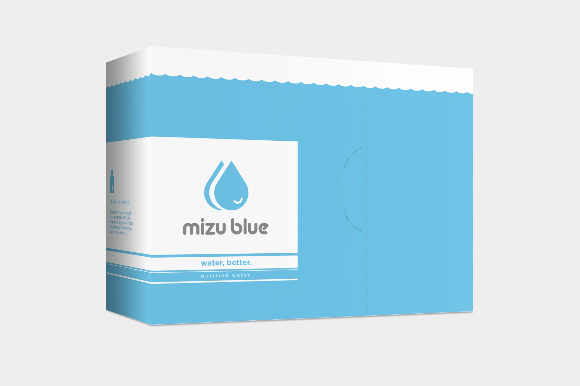
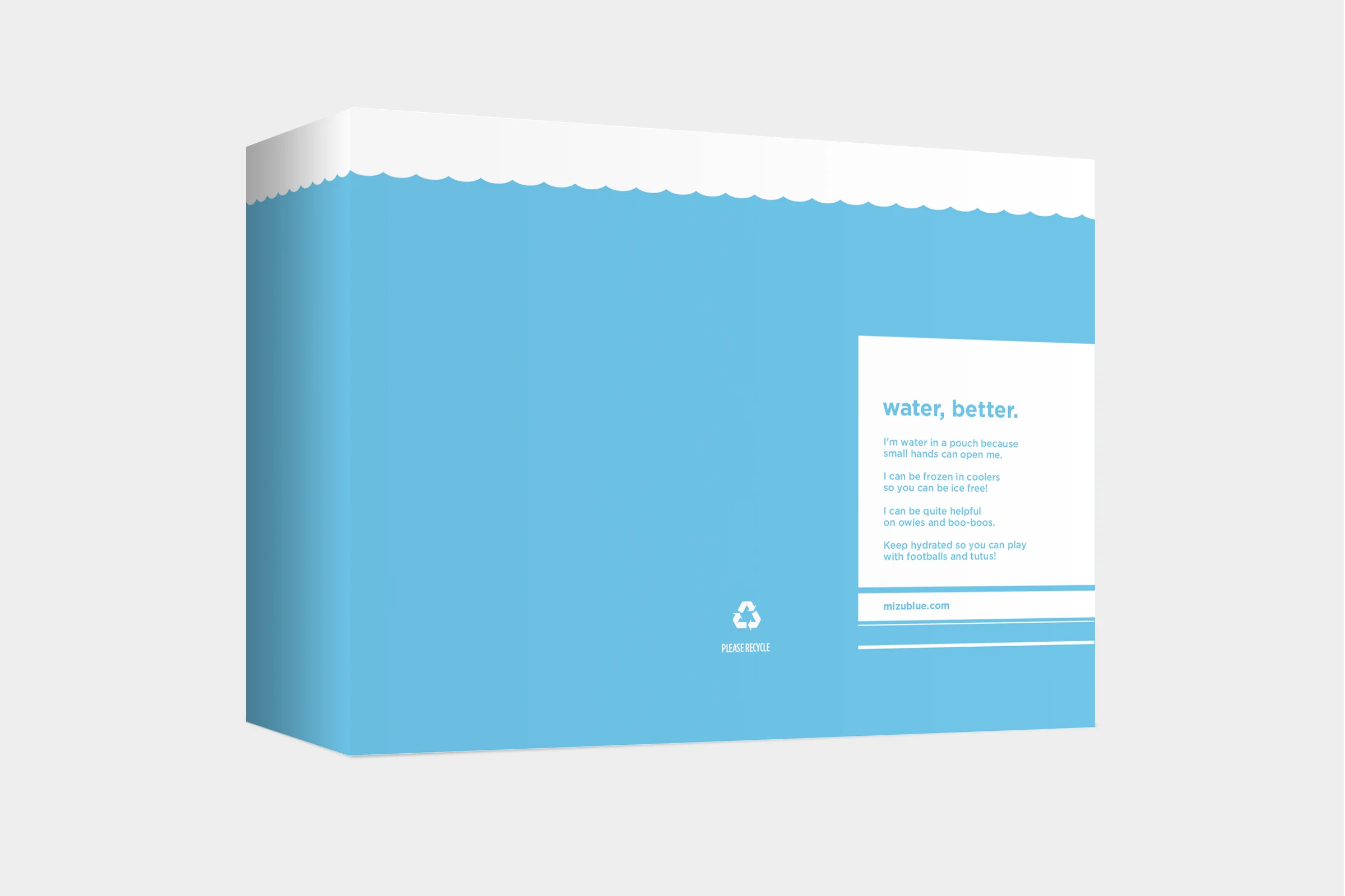
Brand and packaging design for a child-focused water pouch.
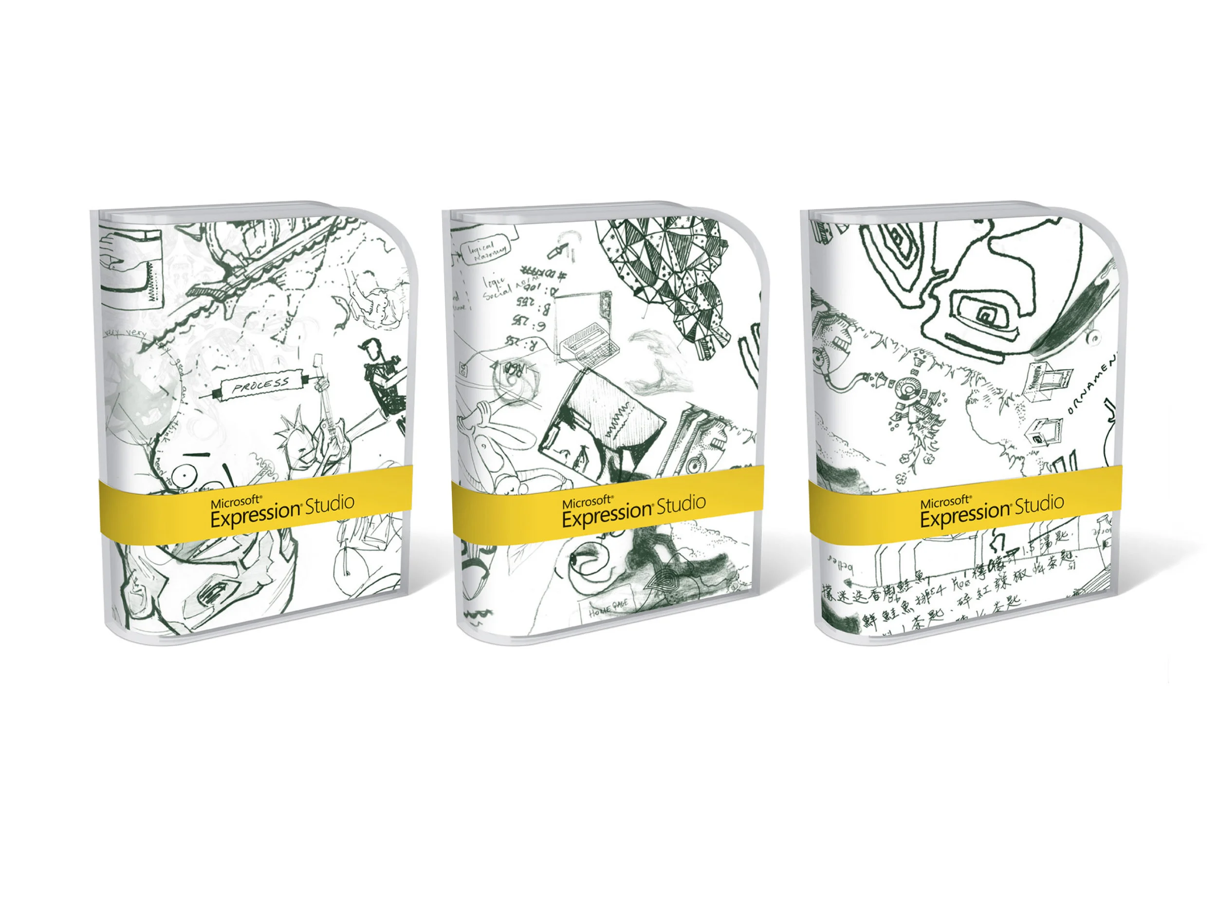
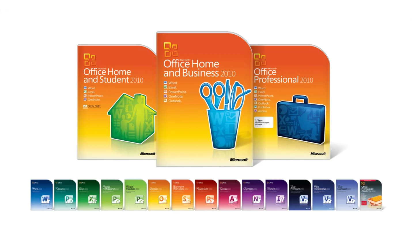
Microsoft was a prominent client during my time living in Seattle. I worked on the brand redesign for Visual Studio along with the Office, Windows, Giving and Education brands, among others.
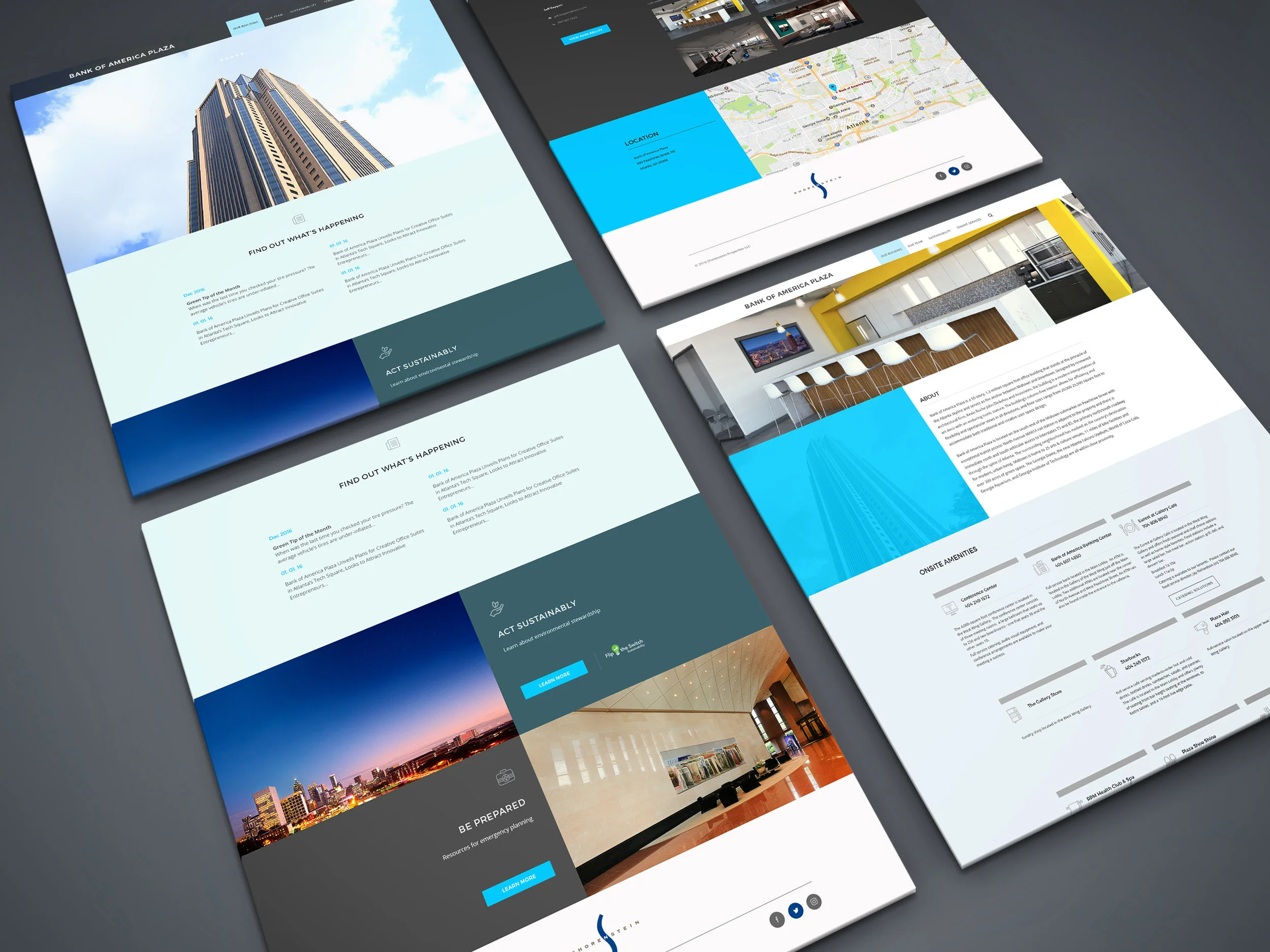
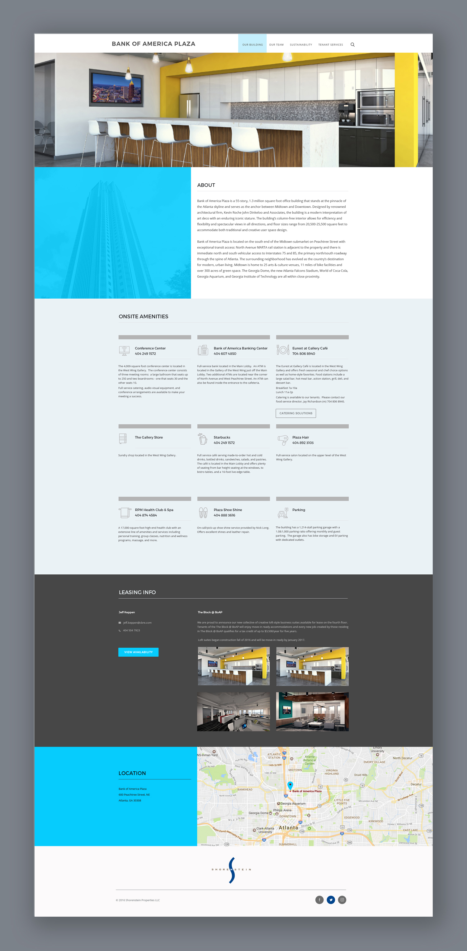
Shorenstein is national real estate investment organization headquartered in San Francisco. They have tasked me with providing a keynote design for their annual investor meeting for the past three years. In addition, I recently developed a new website template for their individual properties.
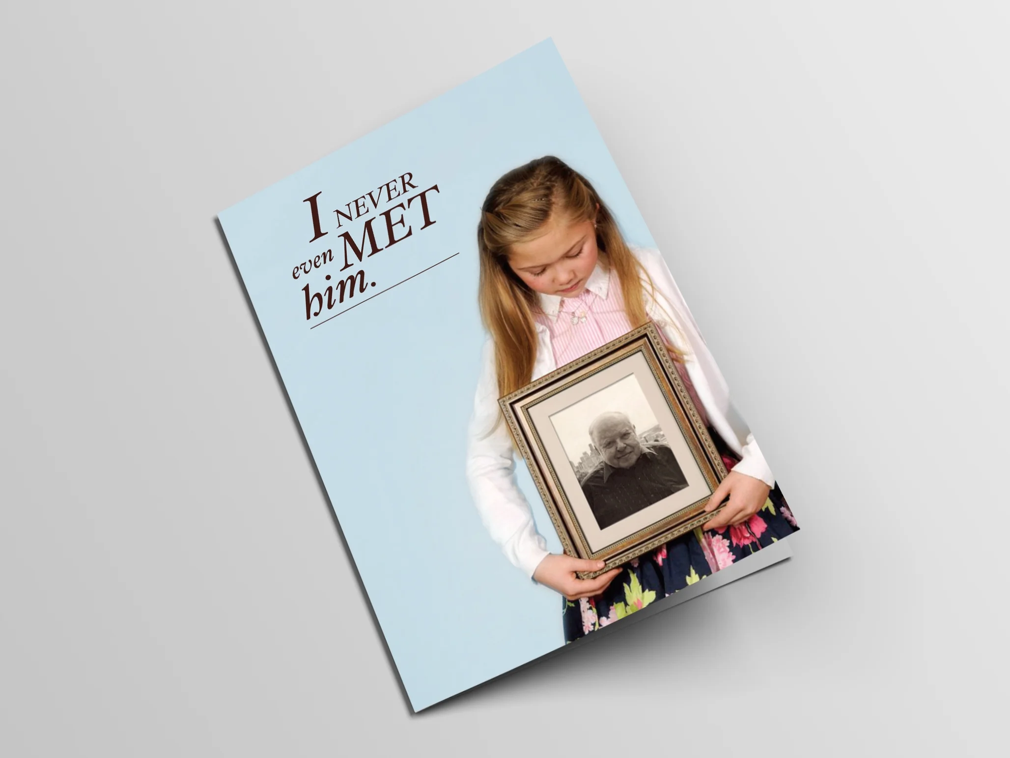
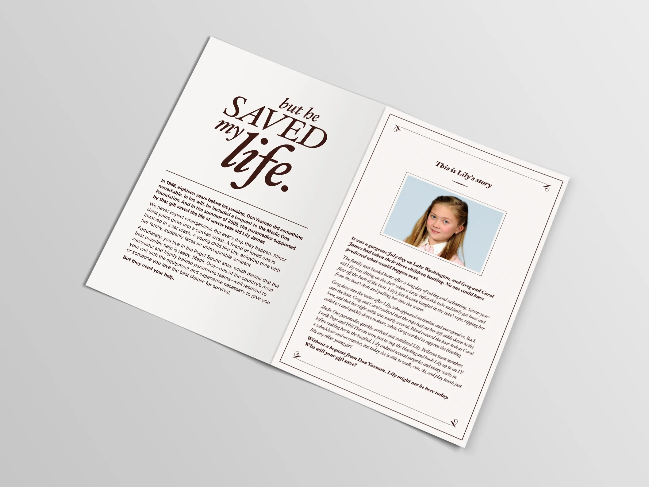
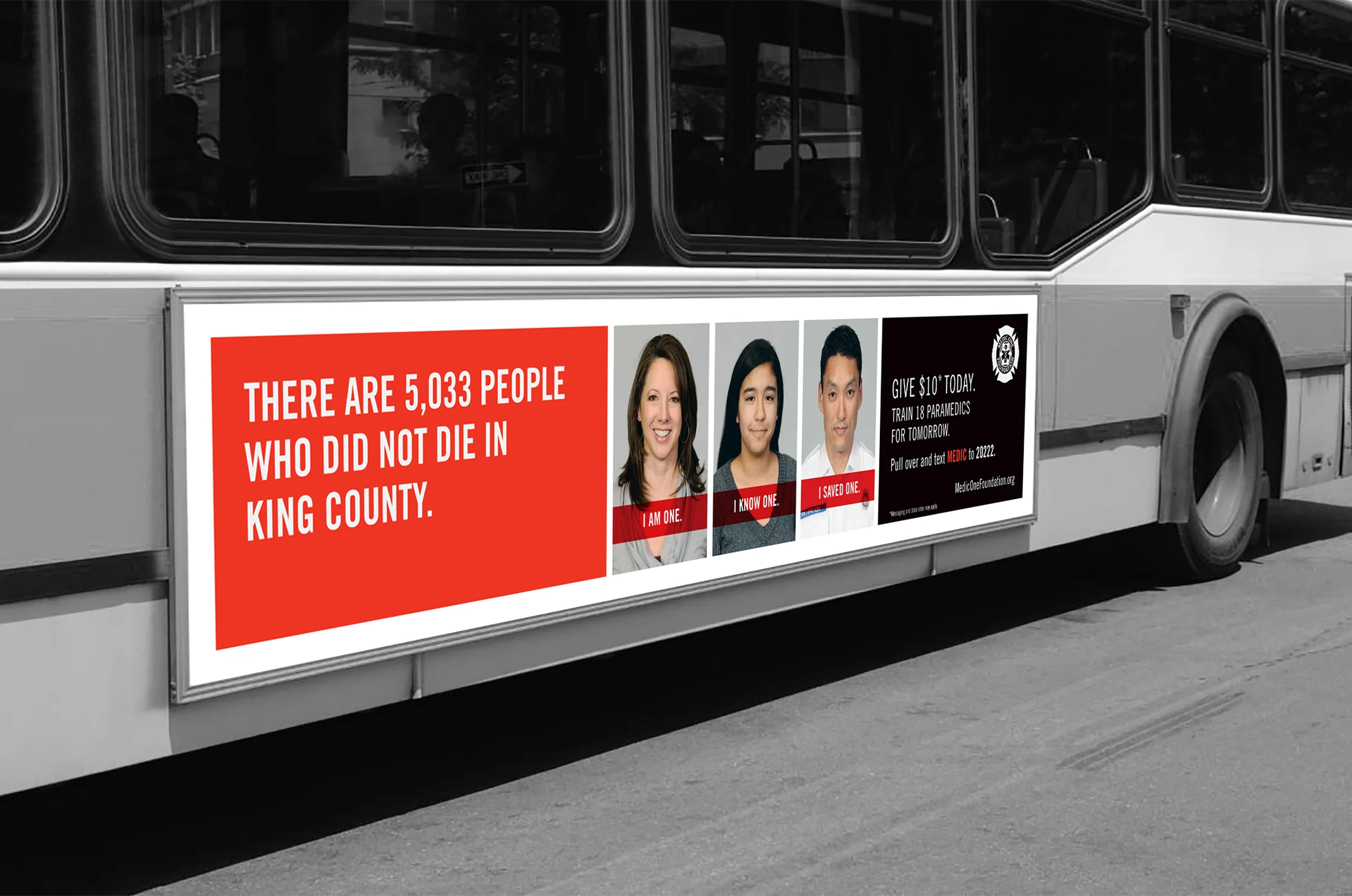
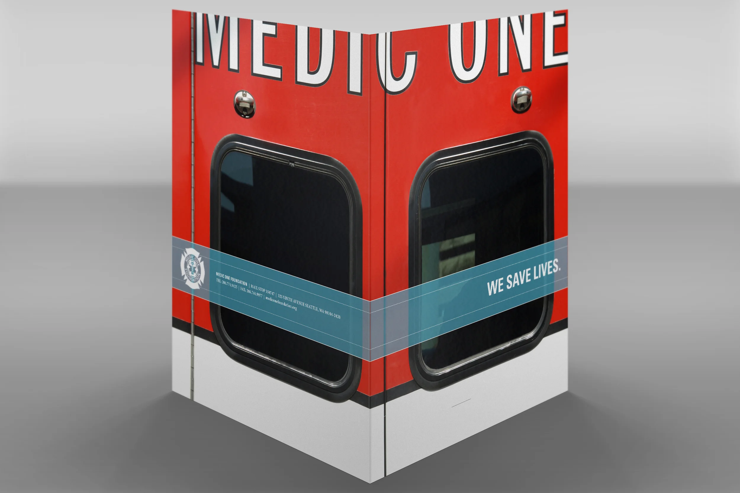
Outreach initiatives for a Pacific Northwest based foundation funding paramedic training.